HR Reporting and Analytics Automation: From Raw Data to Insights
In this guide, we’ll walk through building a structured HR analytics report using data from an Applicant Tracking System (ATS). Our goal is to create an automated dashboard that updates monthly, providing easy-to-read insights into hiring performance and recruitment KPIs.
To build a comprehensive report with visual insights, we need to:
- Structure the data in a new tab for better organization.
- Create a master Google Sheet file to act as our centralized database, where all the cleaned data will be stored and updated monthly.
- Use Zapier to automate data cleaning and filtering ($19/month).
- Build data visualizations using Google Looker Studio (a free tool).
Let’s break down the steps for this process:
Step 1: Determine Your Key Metrics
Before diving into the technical setup, it’s important to define the Key Performance Indicators (KPIs) you want to track and visualize in your dashboard.
Match these metrics with the data collected in your ATS system.
For example, in an ATS we track the following metrics:
- Vacancy
- Recruiter
- Department Needing Hires
- Date of Vacancy Opening
- Date of Vacancy Closure
- Number of Rejected Offers
- Offers Accepted
- # of Candidates in Specific Hiring Stages (Stages: Message Sent, No Response, Screen Call, Tech Interview, Test Assignment, Offer Made, Offer Accepted)
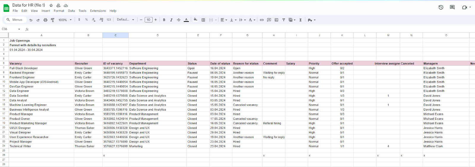
These metrics can be used to track KPIs in a BI system, such as:
- Average Hiring Days
- New Hires by Team
- Average Hiring Days by Recruiter
- Count of New Candidates
- Count of Messages Sent to Candidates
- Offer Conversion Rate, % (Offers Accepted / Total Technical Interviews)
- Bounce Rate by Recruiters, %
Step 2: Create a Structured Data File
Why do we need this step?
To build the HR analytics report and charts, we won’t use Excel formulas this time. Instead, we’ll utilize the free BI system called Looker Studio by Google. Calculation formulas and visualization settings are integrated into the BI system.
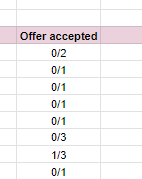
However, if we directly import this CSV file from the ATS into the BI system, the report will be distorted because the columns are not properly formatted. For example, the "Offer Accepted" column might use values like “0/1” instead of “Yes/No,” which the BI system won’t interpret correctly.
2.1 Set Up a New Folder in Google Drive
- Name the folder, e.g., “HR Analytics 2024”.
- Upload the raw monthly ATS file into this folder. Convert it from CSV (or any other format) to Google Sheets format.
- Name the file “HR Analytics – Raw Data”.
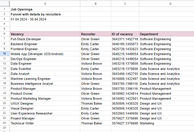
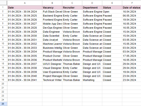
2.2 Clean the Raw Data Using Macros

- Record a Macro to automate the process of data cleanup. For example, remove any unnecessary columns that are not required for your KPIs like ID numbers, Comments, Salary Details, and Manager Names.
- Then move to a new tab with necessary columns like Recruiter, Vacancy, and Date.
- Insert a New Column for the Month: If the hiring month is shown in a single cell at the top, create a new column and repeat the month value for each row. This ensures BI systems can relate each record to a specific month.
{{two-card}}
2.3 Create a Consolidated Google Sheets File
- Create a new Google Sheets file called “HR Analytics – Consolidated”.
- Use this file as your central database for cleaned and structured monthly data.
- Set the titles for each column based on the initial file, ensuring the fields match across all subsequent files.
- Set up the column titles in the first row to ensure data is consistent when merging data with a BI system.
2.4 Reformat the Date Column
Our ATS generates CSV files with the date in the format dd/mm/yyyy. However, for our infographics, we use the Looker Studio application, which does not read this text format and only understands ‘Month yyyy’ (for example, April 2024). That’s why we will convert the date into the “MMMM YYYY” date format.
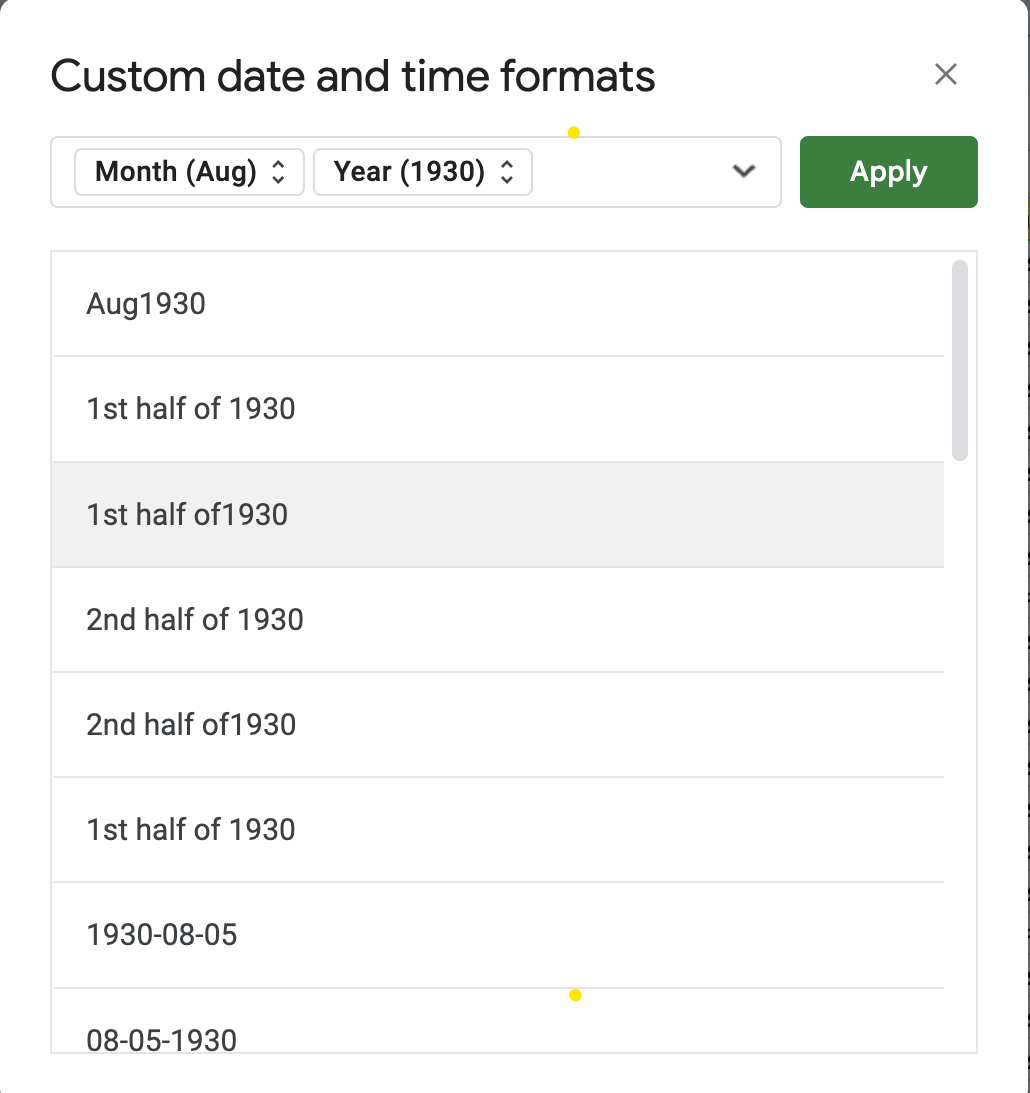
- Go to Format tab > Number > Custom date and time.
In the following steps, we’ll come back to reformatting the date.
2.5 Move Data from the Original File to the Consolidated Sheet
- Using the macro, copy the cleaned data from the monthly sheet to the master file. Ensure data fields match exactly between months for a seamless integration.
Step 3: Automate Data Transformation Using Zapier
Let's imagine you're compiling a yearly HR report and need to gather data from 12 monthly reports from the ATS system. It takes two days to combine these 12 CSV files and make them presentable for the chief manager. But we can do this faster, so it takes up to 20 minutes at the end of the year. To do this, we can use the Zapier platform.
Zapier helps automate repetitive tasks between web applications. In this context, we’ll use Zapier to automate data transfer from one Google Sheet to another.
3.1 Register on Zapier
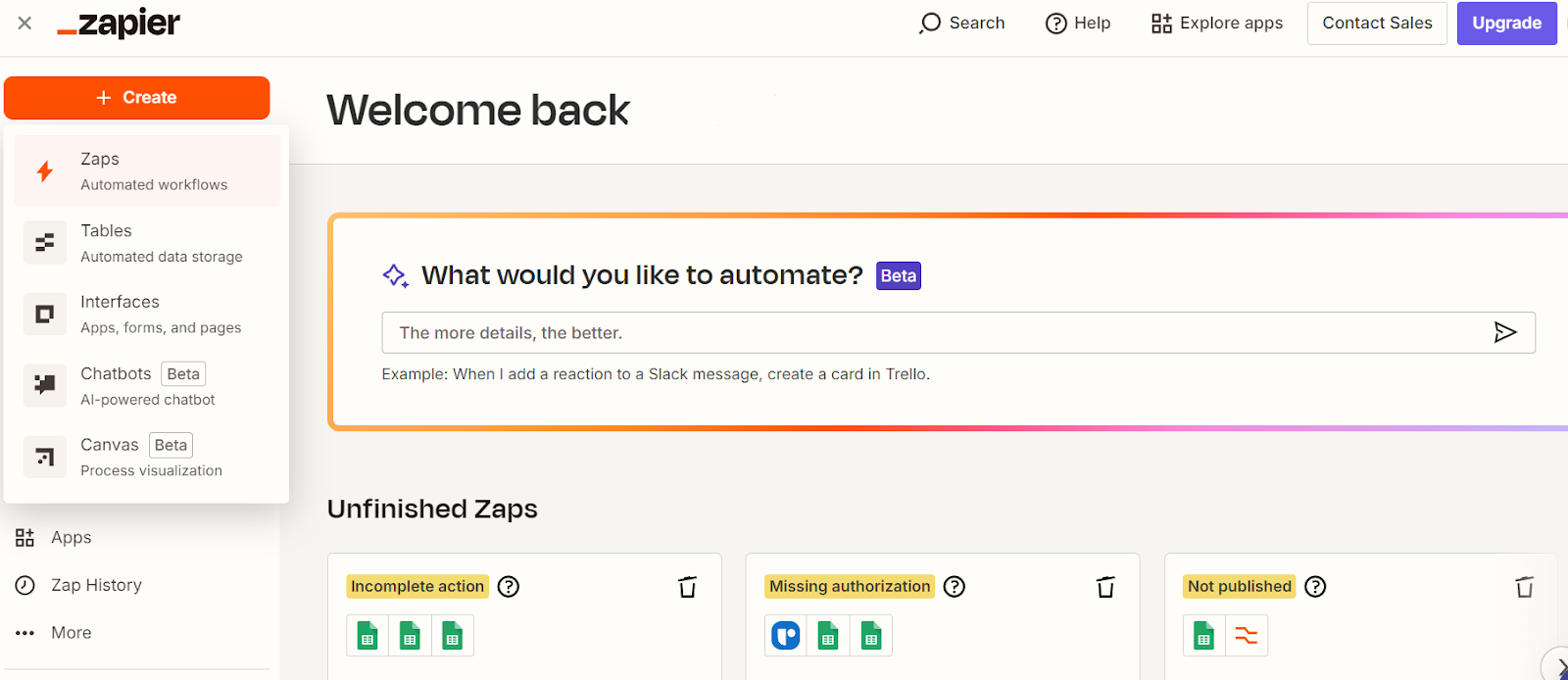
First, register on the platform:
- Create an account and click the orange button “Create Zap”.
- Connect it to your Google Sheets document.
3.2 Create a Zap to Automate Data Updates
We’ll describe a scenario where the columns “Date” and “Offer accepted” need to be automatically changed. We have already written about the “Offer accepted” above. But why are we changing the date format?
Our ATS generates CSV files with the date in the format dd/mm/yyyy. However, for our infographics, we use the Looker Studio application, which does not read this date format and only understands ‘Month yyyy’ (for example, April 2024). Therefore, we need to change the date values through Zapier.
Zapier works on a Trigger-Action basis. For example, the trigger can be when HR adds new vacancy data at the end of the month.
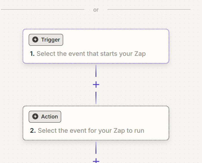
Example: If a new row is added to the Google Sheet, Zapier will automatically perform a defined action, such as calculating total hiring days or deleting unnecessary columns.
To create a Zap for automatically reformatting the date of “Offer accepted” value, proceed with the next flow:
- Select a Trigger Event:
Choose Google Sheets as your app and “New or Updated Spreadsheet Row” as the trigger event.
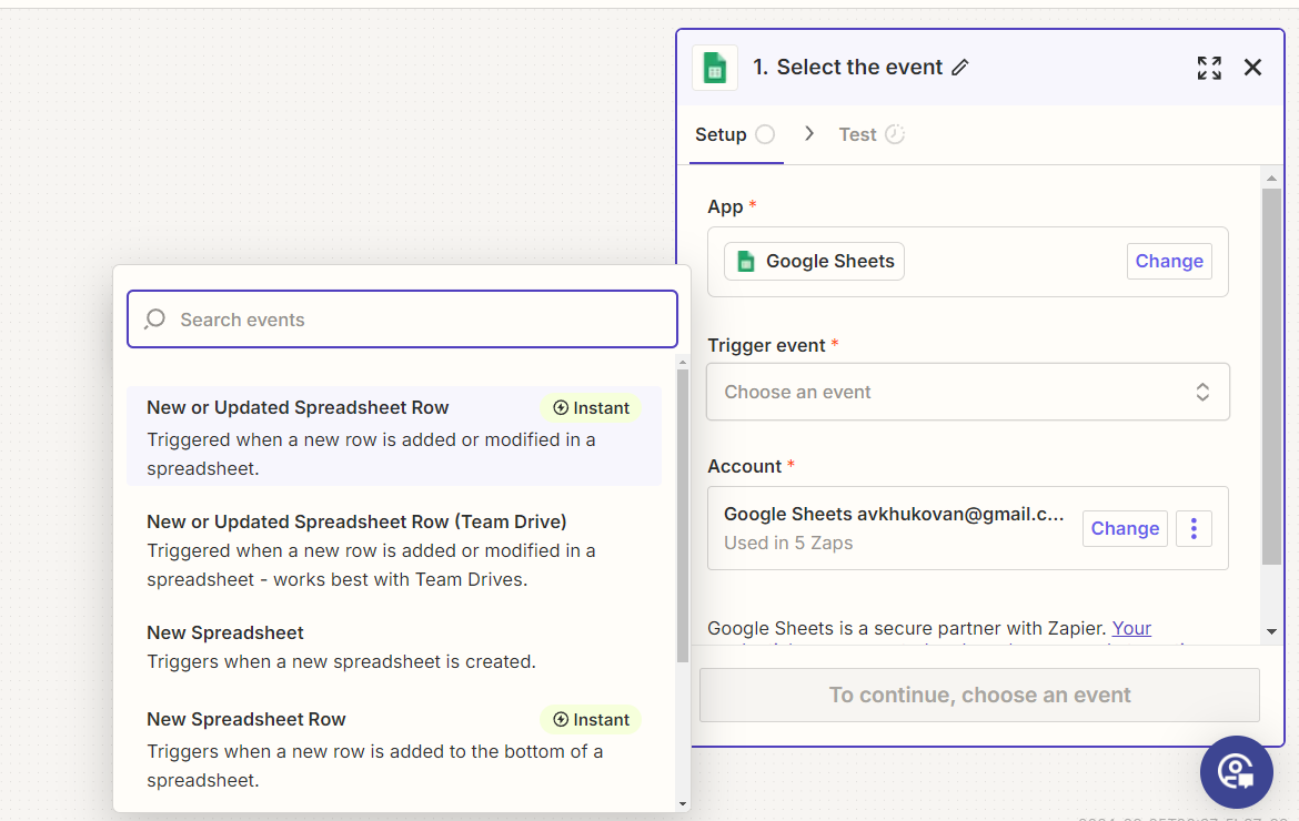
Select the tab and column from your cleaned data file (e.g., “HR Analytics – Raw Data”).
- Do Action Setup:
a) Change the “Offer accepted” column format
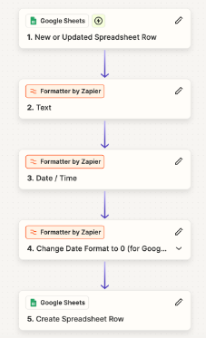
- Choose “Formatter by Zapier” , then “Text” to clean and structure data further, if needed.
- For example, if your “Offer Accepted” column is in “0/1” format, use the “Split Text” function to extract the values before the separator (/).
- In the “Separator” field, enter the “/” symbol.
- In the “Input” field, specify the column you want to extract data from.
- Choose “First” as the Segment Index to select the first value before the separator.
- Test and run the action.
b) Change the “Date” column format
- Click on “+” and choose “Formatter by Zapier”.
- Select the action event: Choose Date/Time.
- Select Format.
- Input: Map the date column from your Google Sheets (e.g., Column with dates like 12/04/2024).
- To Format: Choose MMMM dd yyyy (this format outputs the full month name followed by the year, e.g., April 12 2024).
- From Format: Input the original format of your dates, which in this case is dd/MM/yyyy.
- Click Continue and Test the formatter step to make sure the date appears in the correct format (April 12 2024).
c) Update the Date in Google Sheets
- Add another Action: Choose Google Sheets as the app.
- Action Event: Select Update Spreadsheet Row.
- Connect to your Google Sheet and choose the same sheet you are working on.
- Set up the Row ID: Map the original row ID (titles) from the trigger step.
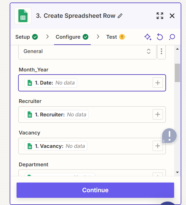
- Map the newly formatted date into the target column where you want to update the formatted dates.
- Test and Turn on the Zap
- Run a test to ensure everything works as expected.
- If the date appears correctly (e.g., April 2024), turn on the Zap.
It’s just one example of how this setup can automatically transform your data according to your needs. Feel free to experiment with other Zapier features to make it easier to upload and visualize your HR reports and analytics in your BI system every month.
Step 4: Build Your BI Dashboard in Looker Studio
Once the setup is complete, after Zapier we go to Looker studio. Looker Studio is a data visualization tool by Google. It helps you create charts and graphs.
Looker Studio connects to various data sources, including Google Sheets, and allows you to visualize key metrics without applying any advanced technical skills. Let’s explore how to use it for HR dashboards.
4.1 Register and Create a New Report
- Log into Looker Studio with your Google account.
- Create a Blank Report.
4.2 Connect to Google Sheets
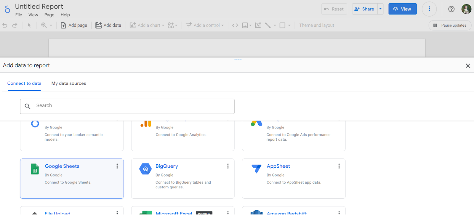
- Click on “Add Data” and select Google Sheets as your source.
- Locate your consolidated HR data file and select the tab containing the cleaned data.
Tip: Ensure that the first row in your Google Sheet contains accurate column headers, as these will be used to create dimensions and metrics in your HR report.
4.3 Build Visualizations for Key Metrics
Now that you have connected your data, let’s add visual charts and tables for the metrics we want to monitor.
Example 1: Hiring Pipeline Funnel
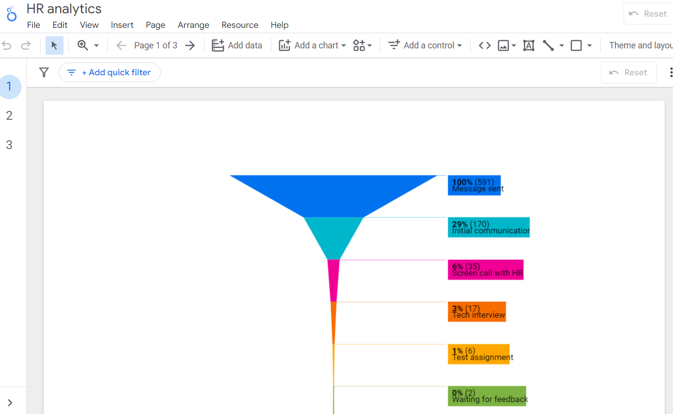
1. Click on the visualizations icon and choose the Metric Funnel.
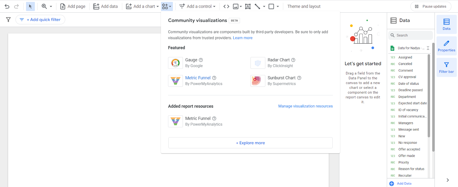
2. Drag and drop fields like “Stage of Recruitment” (e.g., Initial Contact, Screen Call, Interview) into the Funnel Metrics.

3. In the field “Sort” add metrics “Messages sent”.
4. Customize the chart style for clarity.
Example 2: Bounce Rate by Recruiters

- Choose a Bar Chart.
- Set the Recruiter as the dimension.
- Use Bounce Rate as the metric (e.g., % of candidates not progressing to the next stage).
- Aggregate by average to show variations between recruiters.
Example 3: New Hires by Team
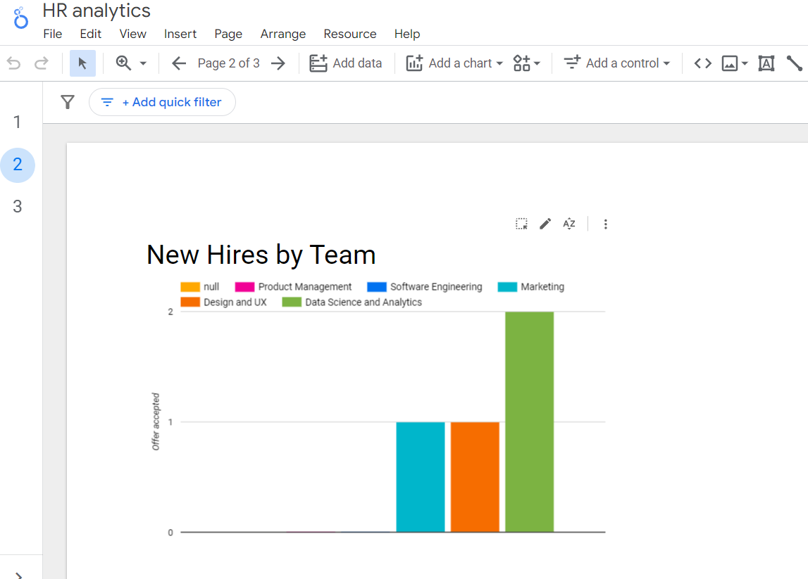
- Choose a Column Chart.
- Set Department as the dimension.
- Use the Count of New Hires as the metric.
- Group by team for better insights.
Step 5: Finalize and Share the Report
Once your visualizations are set up:
- Clean up the report layout by removing any unnecessary elements.
- Add titles and legends to each chart.
- Share the report with your team for collaborative viewing and further analysis.
I hope this tutorial on automating HR reporting and analytics has been helpful. It should allow you to minimize time and effort spent on analyzing your data.
{{quote-text}}
Looking for more tips on how to handle and automate HR reports? Find them plenty on the Juggl blog.
Before Macro
After Macro

.jpeg)


%20(2).jpg)


